Paul's Blog
"The future foretold, the past explained, the present...apologised for.”
|
Doctor Who. BBC TV (1979)
|
Paleogeography in Exploration: Lessons from the Past for the Next Generation of Explorers The original version of this article was published in the August 2020 issue of AAPG Explorer. This copy includes reference citations.  There is something about colored pencil crayons that we, as geologists, find impossible to resist. From geological maps to field sketches, to interpreting seismic on those never-ending rolls of paper taped to the longest corridor wall we can find. What more could any geologist want? This is a source of much mirth amongst my non-geological friends and concern amongst management especially those having just purchased the latest expensive software. Our need for powerful software, paper, and colored pencils reflects a fundamental problem in geology and especially exploration: how to manage, analyze and visualize the diversity and wealth of information required to solve exploration problems. 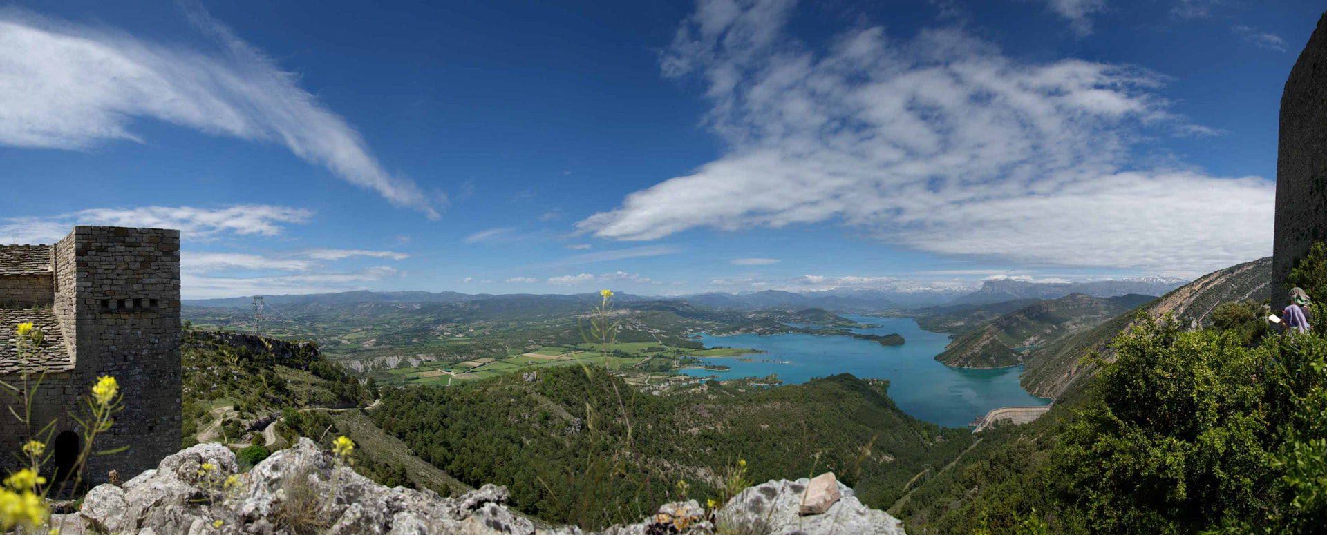 Figure 1. The nature of the problem: There is so much to take in. The view from the Castillo de Samitier north towards Ainsa. There is simply so much to take in. I am reminded of this each spring when Douglas Paton and I take the Leeds MSc Structural Geology with Geophysics students out to the central Pyrenees. This is an area familiar to many of you and highly recommended to those of you yet to visit. As we look out from the Castillo de Samitier with the students, geological notebooks in hand, the challenge is always the same: how far should we, can we, 'stray' away from teaching only the structural geology? If we only focus on the structures, we miss drawing student attention to the important interactions between deformation and the evolution of the turbidite transport pathways; something they will need to know if they ever look at deep-water West Africa or Equatorial South America. To fully understand those pathways requires knowledge of hinterland evolution and the whole source-to-sink story, a story that is heavily dictated by not only tectonic uplift, landscape dynamics, and drainage network evolution, but vegetation cover, bedrock and climate and how these impact weathering and erosion. When we talk about the contemporary climate, what climate? The 'background', 'average' (whatever that means) climate? Or a really 'bad day' in the Eocene? - the Castissent flood events of (Marzo, Nijman and Puigdefabregas, 1988; Mutti et al., 2000), and what does that do to submarine-channel architecture downstream and the interconnectivity, porosity, and permeability of potential reservoirs?... ...and suddenly we find ourselves discussing regional paleogeography, Earth System modeling, the PETM (Paleocene Eocene Thermal Maximum), the importance of extreme events, ala Derek Ager's catastrophic uniformitarianism (Ager, 1984; Ager, 1993) and plate tectonics, and we have lost most of the day and possibly our audience... There is simply so much to take in. So, what do we do? Focus just on the structures? That is the MSc course title after all. Or do we bring in the other parts of the story - the bigger picture? The answer is, of course, the latter, and the reason is obvious. To solve geological problems in exploration we need to consider all the components. Explorationists, and therefore our students, need to know enough of the vocabulary of each part of the Earth system to know what questions to ask, where to look for answers, and how the components fit together to dictate source rock geometry and character, trap formation and timing, reservoir quality and all the other plethora of geological risks they will need to assess as explorationists. Paleogeography as a solution This is not a new problem. 200 years ago, the early geologists were faced with the same challenge, how to manage, analyze and visualize the rapidly expanding observations accumulating in the databases of the time – the world’s libraries and museums. One solution was to map out (in color of course) the accumulated knowledge on reconstructions of the past distribution of land and sea such as those of Elie de Beaumont in France and Charles Lyell in Britain (Lyell, 1837). For the first time here were representations of what the Earth looked like in the geological past. But by the 1870s it was clear that more was needed, especially following the Pennsylvanian (1859) and Ontario (1858) discoveries and the birth of oil exploration (Sorenson, 2007). 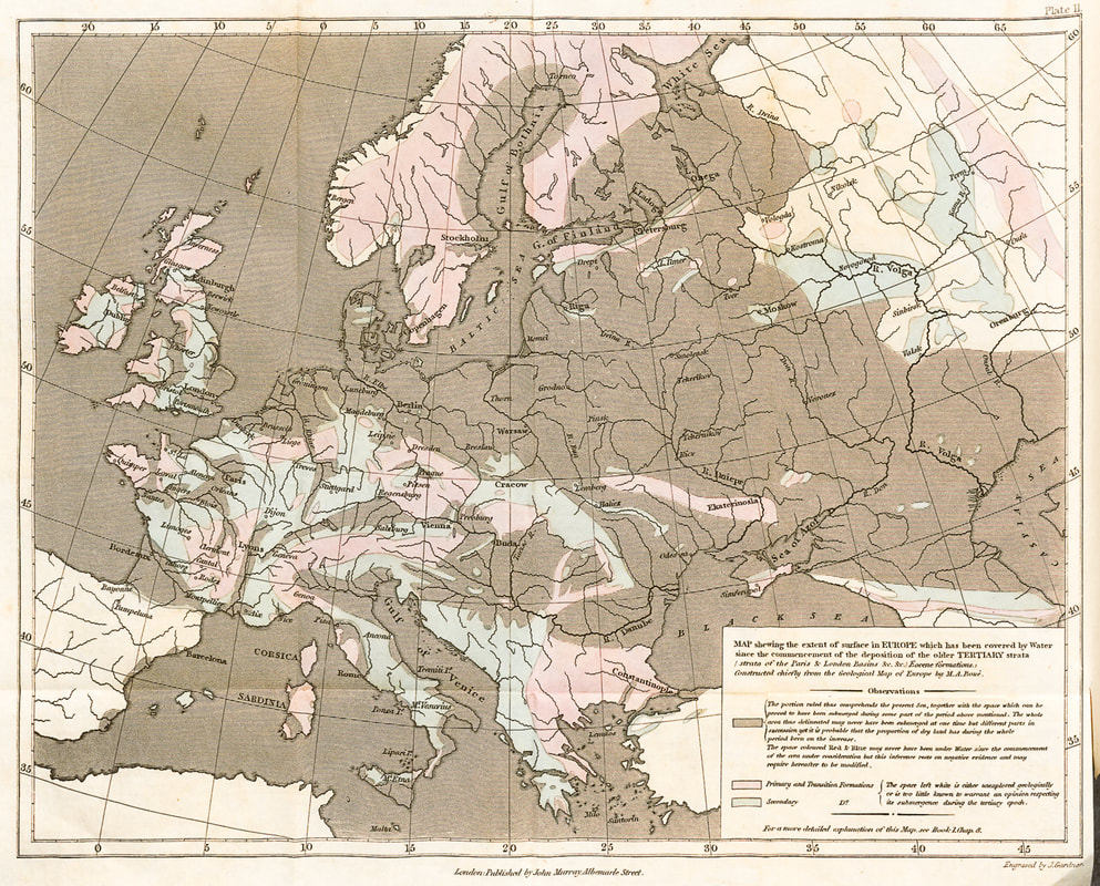 Figure 2. Charles Lyell’s 1837 land-sea map of the Tertiary of NW Europe It was one of the first petroleum geologists, Thomas Sterry Hunt, who saw the value of paleogeography in exploration, and who, in 1873, first coined the term 'paleogeography’ (Hunt, 1873). Hunt had worked in the Ontario discoveries (Hunt, 1862) and was one of several geologists who had simultaneously recognized the importance of anticlinal traps. It is probably this structural experience that led Hunt to realize that in order to reconstruct paleogeography (past landscapes) you first need to understand the underlying “architecture of the Earth”, the crustal architecture on which the landscapes are formed. Despite the obvious benefits of mapping structural evolution and depositional systems spatially in geological time, Hunt's ideas were not immediately utilized. It is true, that over the following three decades there were a large number of paleogeographic maps drawn. From Alfred John Jukes-Brown’s Building of the British Isles (Jukes-Browne, 1888), in which he showed paleorivers, albeit only on a few maps, and somewhat schematically, to James Dana's first maps of North American paleogeography (Dana, 1863). By 1900 Albert August Cochon de Lapparent (Lapparent, 1900) felt confident enough to draw the first series of global paleogeographies, including a best guess at what was happening in the Atlantic and Pacific. But in all these cases the maps were still land-sea maps. It was to be in Germany that geologists finally started to bring together crustal architecture and paleogeography as Hunt had originally advocated over 30 years before. From Franz Kossmat’s geological history of land and sea distributions (Kossmat, 1908), albeit heavy on text and light on maps, to Theodor Ardlts ‘Handbuch der Palaeogeographie’ (Arldt, 1917). But, with Alfred Wegener (Wegener, 1912), the potential to put together continental drift, palaeobiogeography, crustal architecture and Earth structure within paleogeography, seemed within reach. Indeed all of these elements were discussed in a single book by Edgar Dacqué in 1915 (Dacqué, 1915). The consequence should have been the first atlases of paleogeographies on plate reconstructions. “Should have been,” that is. Unfortunately, 1914-18 was a terrible time to be a German scientist trying to promote ideas to American and European audiences. And so, as a sad consequence of contemporary politics, there was no atlas, and development stopped and much of this literature was largely forgotten. Or rather, almost forgotten. The Yale View of Paleogeography When in 1904 Charles Schuchert joined the faculty at Yale as Professor of Paleontology he was faced with a problem, how to teach the breadth of geology. His solution was to use paleogeographic maps to show how the Earth had changed over time. It was to become a life-long passion. Schuchert knew the German work (his parents were German émigrés) and he was well versed in the 19th and early 20th-century geological literature, including that of Hunt. He was also a colleague of Joseph Barrell, one of the founders of modern stratigraphy. Consequently, Schuchert not only took Hunt's workflow, but also emphasized the importance of constraining time. For Schuchert, a paleogeographic map representing a large geological interval, such as the whole Cretaceous, was meaningless, given the major changes that occurred over even the shortest of geological intervals. The resulting paleogeographic atlas of North America, first published in 1910, comprised 60 maps at much higher detail than before and set the tone for paleogeographic research for the rest of the 20th century. Considered together with paleo-climatology and -oceanography these paleogeographies could provide information on depositional systems. When this was linked with structure (it was Schuchert who first stressed the importance of understanding deformation by palinspastically reconstructing the past geography - deformable plates to you and me) this integrated view could have huge benefits for petroleum exploration (Schuchert, 1919). 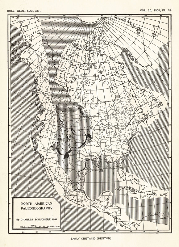 Figure 3. Charles Schuchert’s paleogeographic map of the Turonian of North America Missed Opportunities and Continued Frustration And yet, 25 years after Schuchert's first maps, we find another petroleum geologist, John Emery Adams (1943), lamenting that paleogeography was still underutilized in the industry. Yes, there were more maps being drawn, but these were mostly local in extent, and more often than not more facies map than paleogeography. The standout exception was the work of Alexander Du Toit, another geologist familiar with the German literature and especially Wegener’s work. He had put all the components together to generate the first paleogeographic reconstruction of Gondwana back in 1937 (Du Toit, 1937) having already published a restored fit for South America and Africa (Du Toit and Reed, 1927). But hey, he was in South Africa and what did he know? Quite a lot as it turned out. But in North America and Europe little was done. Adams suggested three reasons:
Having spent my career building paleogeographic maps, I empathize with Adams's frustration. And yet, here was a great exploration opportunity, as Adams realized. Because if you put paleogeography together with reconstructions of climate and oceanography you could potentially predict source and reservoir facies, and what a great exploration advantage that would provide. Plate Tectonics and the penny drops Adams was to include some of these ideas in his eulithogeologic maps, which were very much a precursor to the play concept. The importance of bringing paleogeography together with depositional systems, structure, paleo-climatology, and -oceanography was further developed by Marshall Kay a few years later (Kay, 1945). But, it was to be another 30 years before the Industry realized what they had been missing when suddenly all the pieces fell into place, metaphorically and, as it happened, literally. This was the advent of plate tectonics. What the German workers had recognized and discussed at the turn of the century, now had observational support and a unifying mechanism (Heezen, 1960; Heirtzler, Pichon and Baron, 1966; Hess, 1962; Vine and Matthews, 1963; Wilson, 1963; Wilson, 1965). Suddenly, geologists were rushing to plot their exploration data on the new plate reconstructions, together with paleo-coastlines and land-sea distributions. The result was an explosion in paleogeographic research with companies either generating their own maps internally or working with research groups to do so. It was the late 1970s and exploration following the oil crisis of 1973 was in full swing. Great... But these were still land-sea maps (coastlines), and there was an increasing problem of how to deal with all the new data, especially now that this had to be rotated onto plate reconstructions which multiplied the volume of data created by orders of magnitude. Paleogeography, Computers and big data in the Windy City The Hinds Laboratory, home to the Department of the Geophysical Sciences at The University of Chicago, is one of those architectural 'wonders' that wins awards for architecture, and everyone 'wonders' why. In the 1970s and 1980s, the second floor was home to the leading figures in quantitative paleontology. Nothing short of the analysis of the entire fossil record. Big data indeed. The result was the discovery of the five great mass extinctions (Raup and Sepkoski, 1984; Sepkoski and Raup, 1985). In another corner of the second floor, Fred Ziegler was also manipulating large datasets using early computer systems, this time to build paleogeographic maps (Ziegler et al., 1985). Fred's background, like Schuchert’s, was Paleozoic paleobiology, especially the use of fossil assemblages to reconstruct paleobathymetry. It was to be this interest that was to differentiate the Paleogeographic Atlas Project and the students it spawned. Because Fred’s maps included reconstructions of paleo-bathymetry and paleo-elevation – the paleo-landscape. Schuchert had talked about this, and indeed there had been attempts to show paleolandscapes such as that of Pepper et al (1954), but those of the Atlas project were systematically constructed based on the underlying tectonics. They were also global in extent, constrained in time to stage level (probably the highest realistic resolution at a global scale), and took some account of palinspastic changes following the work of Kay (Kay, 1945) and Schuchert. Fred's work had three immediate consequences. First, the reconstruction of landscapes was key to understanding depositional systems because it was on these paleo-landscapes that the rock record was built. A particle sees topography, rivers, and oceans. It does not see mantle convection or hyper-extension, at least not directly. Weathering and erosion, transport, and ultimately deposition are a function of what happens at the surface. Second, if you could model depositional systems, then you could model source, reservoir and seal facies, as Adams had suggested back in 1943. This led Judy Parrish, another of Fred’s students, to take the new paleogeographies, use these as the boundary conditions for her parametric climate modeling and then to take the results to retrodict (predict past events) the distribution of ocean upwelling and through this the areas of potential organic carbon accumulation - source facies (Parrish, 1982; Parrish and Curtis, 1982). The third consequence was data management. Underpinning the new atlases of paleogeography were some of the first computer-based geological research databases. What Fred and his students realized as they built these was the need to better ‘know’ the data itself, specifically its provenance and reliability. ‘Big Data’ can be a very powerful resource, but only if the data is well-constrained. Unconstrained data is simply big bad data and that is worthless. What Fred did was to find ways to qualify data quality and mapping confidence and provide an audit trail for interpretations. The confidence schemes Fred derived were simple (Ziegler et al., 1985), a categorization of 1-5 where “1” indicated caution and “5” represented the highest confidence. But that simplicity ensured clarity and, more importantly, that the databases would be populated. As Markwick and Lupia later wrote, having worked with Fred, “A database must be simple enough to be used, but comprehensive enough to be useful” (Markwick and Lupia, 2001). The Atlas Projects databases were then linked to the source data through a reference code to computerized reference database with physical copies of all papers stored alphabetically on shelves around the walls of Fred's workroom. 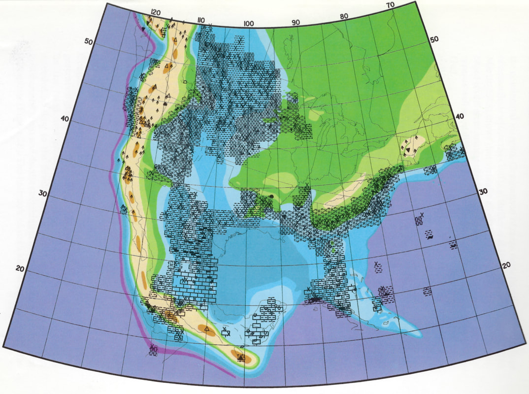 Figure 4. Fred Ziegler's Cenomanian map of North America. The use of computer databases and representation of paleotopography and paleobathymetry Where next? Today, 50 years after plate tectonics, and 150 after Hunt, we are spoiled for choice by the plethora of maps that are readily available online such as those of Chris Scotese and the beautiful photoshopped images of Ron Blakey, which adorn many of the posters and presentations at AAPG each year. The ideas of Hunt, Schuchert, Adams, Kay, and especially Ziegler have been developed and expanded, not least by Fred’s students, including Chris Scotese, who has perhaps done more than anyone else over the last 40 years to promote paleogeography. My own small contribution has been to build on Fred’s methods to improve paleogeographic boundary conditions for climate modeling (Markwick and Valdes, 2004), further developing the mapping workflow (Markwick, 2019) and then applying these methods to exploration through the development of the lithofacies prediction methodologies that ultimately became CGG Robertson’ Merlin and Getech’s Globe products, both of which used detailed global paleogeographies and Earth system models to retrodict depositional systems, as Adams had advocated back in the 1940s. 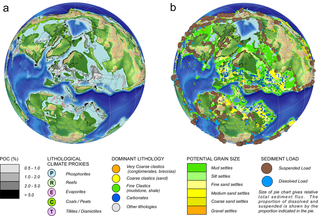 Figure 5. As Hunt, Schuchert, Adams, and Ziegler had all recognized, the greatest potential of paleogeography as an exploration tool has always been the ability to represent, analyze and understand all the components in the system. In this example to then use these to retrodict organic carbon and clastics for any time interval. And yet, like Adams back in 1943, it feels that despite all this progress, for most explorationists paleogeographies are still only seen as backdrop images for presentations and montages rather than a key exploration tool. That is a great shame. It is time to get out the colored pencils … Acknowledgments This article was first published in the August issue of AAPG Explorer. It is based on a talk I gave at last year's AAPG meeting in San Antonio. My thanks go to Matt Silverman and Amanda Haddad who chaired the session, “Step Changes in Petroleum Geology: Historical Challenges and Technological Breakthroughs”, and especially to Matt for his kind invitation to write this article for Explorer. I am also indebted to Brian Ervin and Matt Randolph of AAPG in Tulsa who did such a great job with the layout. References Adams, J. E. 1943. Paleogeography and petroleum exploration. Journal of Sedimentary Petrology 13 (3), 108-11. Ager, D. V. 1984. The stratigraphic code and what it implies. In Catastrophes and Earth history: the new uniformitarianism eds W. A. Berggren and J. A. Van Couvering). pp. 91-101. Princeton University Press. Ager, D. V. 1993. The nature of the stratigraphic record, 3rd ed. Chichester: John Wiley & Sons, 151 pp. Arldt, T. 1917. Handbuch der Palaeogeographie. Leipzig: Gebrüder Borntraeger, 1647 pp. Dacqué, E. 1915. Grundlagen und methoden der paläogeographie. Jena, Germany: Verlag von Gustav Fischer, 499 pp. Dana, J. D. 1863. Manual of Geology. Treaing of the principles of the science with special reference to American geological history. For the use of colleges, academies and schools of science. Philadelphia: Theodore Bliss & Co., 796 pp. Du Toit, A. L. & Reed, F. R. C. 1927. A geological comparison of South America with South Africa. Washington, D.C.: Carnegie Institution of Washington, 157 pp. Du Toit, A. L. 1937. Our wandering continents - an hypothesis of continental drifting, 1st ed. Edinburgh: Oliver and Boyd, 366 pp. Heezen, B. C. 1960. The rift in the ocean floor. Scientific American 203 (4), 98-110. Heirtzler, J. R., Pichon, X. L. & Baron, J. G. 1966. Magnetic anomalies over the Reykjanes Ridge. Deep Sea Research and Oceanographic Abstracts 13 (3), 427-32. Hess, H. H. 1962. History of Ocean Basins. In Petrologic Studies: A Volume to Honor A. F. Buddington eds A. E. J. Engel, H. L. James and B. F. Leonard). pp. 599-620. Boulder: Geological Society of America. Hunt, T. S. 1862. Notes on the history of petroleum or rock oil. In Annual report of the board of regents of the Smithsonian Institution, showing the operations, expenditures, and condition of the institution for the year 1861 pp. 319-29. Washington, D.C.: Government Printing Office. Hunt, T. S. 1873. The paleogeography of the North-American continent. Journal of the American Geographical Society of New York 4, 416-31. Jukes-Browne, A. J. 1888. The Building of the British Isles, 1 ed. London: George Bell and Sons, 343 pp. Kay, M. 1945. Paleogeographic and palinspastic maps. American Association of Petroleum Geologists Bulletin 29 (4), 426-50. Kossmat, F. 1908. Paläogeographie (Geologische geschichte der meere und festländer) Leipzig: G. J. Göschen, 169 pp. Lapparent, A. A. C. d. 1900. Traité de Géologie, 4th ed. Paris: Masson et Cie, 1237 pp. Lyell, C. 1837. Principles of Geology: being an inquiry how far the former changes of the Earth's surface are referable to causes now in operation, 5 ed. Philadelphia: James Kay, Jun. & brother, 462 pp. Markwick, P. J. & Lupia, R. 2001. Palaeontological databases for palaeobiogeography, palaeoecology and biodiversity: a question of scale. In Palaeobiogeography and biodiversity change: a comparison of the Ordovician and Mesozoic-Cenozoic radiations eds J. A. Crame and A. W. Owen). pp. 169-74. London: Geological Society, London. Markwick, P. J. & Valdes, P. J. 2004. Palaeo-digital elevation models for use as boundary conditions in coupled ocean-atmosphere GCM experiments: a Maastrichtian (late Cretaceous) example. Palaeogeography, Palaeoclimatology, Palaeoecology 213, 37-63. Markwick, P. J. 2019. Palaeogeography in exploration. Geological Magazine (London) 156 (2), 366-407. Marzo, M., Nijman, W. & Puigdefabregas, C. 1988. Architecture of the Castissent fluvial sheet sandstones, Eocene, South Pyrenees, Spain. Sedimentology 35 (5), 719-38. Mutti, E., Tinterri, R., di Biase, D., Fava, L., Mavilla, N., Angella, S. & Calabrese, L. 2000. Delta-front facies associations of ancient flood-domainted fluvio-deltaic systems. Revista de la Sociedad Geológica de España 13 (2), 165-90. Parrish, J. T. 1982. Upwelling and petroleum source beds, with reference to Paleozoic. American Association of Petroleum Geologists Bulletin 66 (6), 750-74. Parrish, J. T. & Curtis, R. L. 1982. Atmospheric circulation, upwelling, and organic-rich rocks in the Mesozoic and Cenozoic eras. Palaeogeography, Palaeoclimatology, Palaeoecology 40 (1-3), 31-66. Raup, D. M. & Sepkoski, J. J. 1984. Periodicity of extinctions in the geological past. Proceedings of the National Academy of Science, U.S.A 81 (3), 801-05. Schuchert, C. 1919. The relations of stratigraphy and paleogeography to petroleum geology. Bulletin of the American Association of Petroleum Geologists 3 (1), 286-98. Sepkoski, J. J. J. & Raup, D. M. 1985. Periodicity in marine mass extinctions. In Dynamics of Extinction (ed D. Elliott). New York: John Wiley and Sons. Sorenson, R. P. 2007. First impressions: petroleum geology at the dawn of the North American oil industry. Search and Discovery 70032. Vine, F. J. & Matthews, D. H. 1963. Magnetic anomalies over oceanic ridges. Nature 199 (4897), 947-49. Wegener, A. 1912. Die Entstehung der Kontinente. Geologische Rundschau 3 (4), 276-92. Wilson, J. T. 1963. Evidence from islands on the spreading of ocean floors. Nature 197, 536-38. Wilson, J. T. 1965. A new class of faults and their bearing on continental drift. Nature and Science 207, 343-47. Ziegler, A. M., Rowley, D. B., Lottes, A. L., Sahagian, D. L., Hulver, M. L. & Gierlowski, T. C. 1985. Paleogeographic interpretation: with an example from the Mid-Cretaceous. Annual Review of Earth and Planetary Sciences 13, 385-425. A pdf version of this blog is available here for download
1 Comment
Field sketching in geology: time to think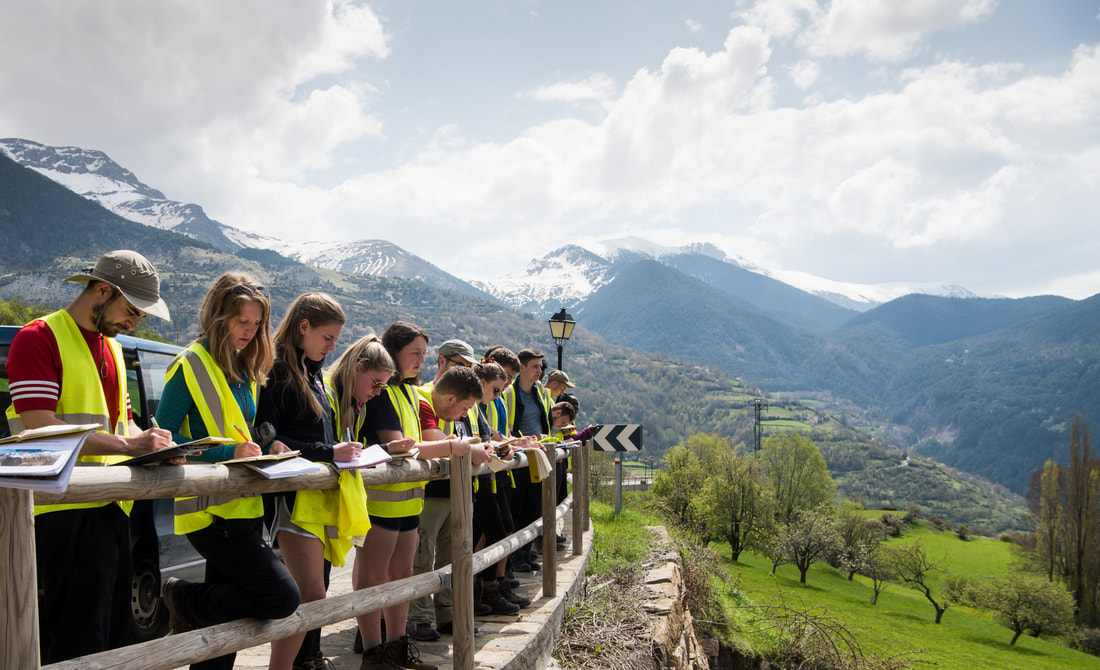 Field sketching is something that many geology students dread, at least those whose departments still take them outside to see rocks in their natural habitat. “What am I supposed to draw?” “I cannot draw” “I have an iPhone so why do I need to draw?” Part of this reticence is a fear of what our colleagues will think when they see what we have drawn. And certainly, the sketching of some of our past MSc’s, who will remain nameless, has erred towards the surrealist movement more than one might hope. But this belies the fundamental reason for sketching in geology. The aim is not to create a Rembrandt. If it were, we would be issuing oils and watercolor paints (tempting for next year). The objective is to help us to observe, to think and to understand what we are looking at. That is also why the iPhone, brilliant that it is (and it is certainly part of my workflow as you will see), does not make sketching redundant. So out with the sketchbook and pencils. 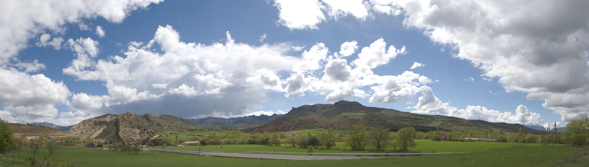 Figure 1. The view east from near Aren, central Pyrenees (Locality 1.4. on the Leeds MSc course). So much to take in so where do we start? Why sketch? Geology is a highly visual subject and a very diverse one. Like all science, it is grounded in primary observations. But the diversity of what we need to consider for us to understand those observations gives us a problem. There is so much to take in. Where do we start? In Spain, the first thing we get our MSc students to do when they look at an outcrop is to draw a sketch. But why? For me there are three principal reasons for starting with a sketch:
A workflow for sketching This is how I go about a sketch. This is not the only way, and others will have their own, preferred methods. My background (in the very distant past) was art, which may bias my approach. I have included links to some other resources at the end of this article. 1. Decide on how much of the view you need to capture The first question is how much of the view to capture. This depends on the focus of your study. In the example used in this blog from the central Pyrenees, the focus of this outcrop is the seismic-scale stratigraphic relationships and what they tell us about the evolution of the underlying structure, and what that structure might be. 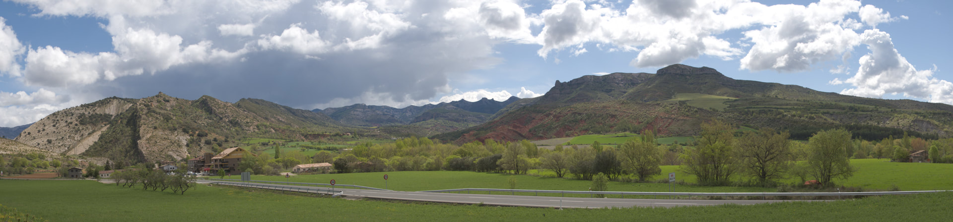 Figure 2. The first step is to identify what part of the view you need to sketch. This will depend on the scientific subject you are investigating. 2. Use the full extent of your notebook or input device For sketches of large outcrops, especially if, as in this example here, you are capturing seismic-scale features, use the full extent of your notebook page. Ideally, use your notebook in landscape orientation across two pages. This gives you more space to add notes.  Figure 3. Use a notebook that you can place into landscape orientation. 3. Identify the central vertical and the edges of the view you intend to draw. Again, using your notebook in landscape orientation can help, with the central vertical being the spine of the book. Mark in the left and right limiting verticals and keep to these extents 4. Identify key reference points and mark 3-4 of these on your page (useful as a guide especially if you are not confident in your sketching If you have a field notebook with ruled feint lines and other lines (or a square grid) then these provide you with a very useful guide that can be lined up with key points in the landscape 5. Draw in the horizon Drawing the horizon and foreground limits will define the extent of the sketch. These are the first lines I draw. I tend to draw from left to right in one go, but sometimes it can be useful to draw away from the edges and center references points. Use your pencils held at arm’s length to get a sense of scale and perspective. By constraining the extent from the outset, you can avoid running out of space. There is nothing worse than starting a ‘great’ sketch and finding that all the action is off the page. 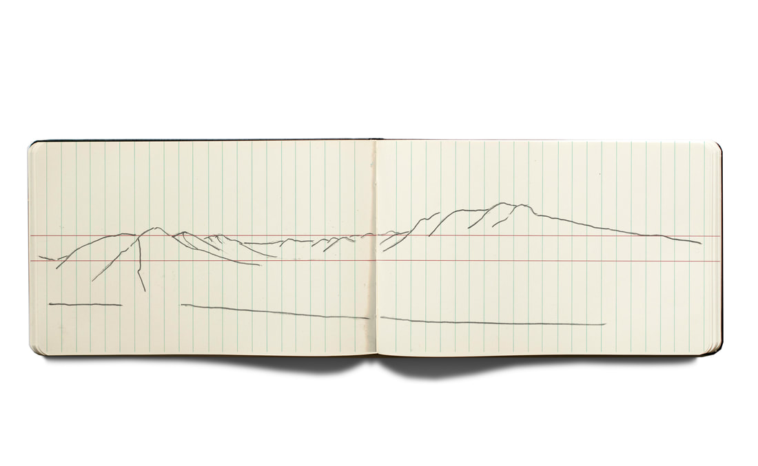 Figure 4. The first lines on the map are the horizon and foreground limits that help define the extent of the sketch. 6. Add location information and azimuths Add the locality number and other spatial information. This should include the date and weather conditions. The latter is useful for understanding what you can and cannot see. Use your compass to identify the azimuth of your key verticals on the page and write this information as a 3-digit number at the top of the page in line with each vertical. Add north, south, east, and west as appropriate. In the past, I have put this locality information on the page first, but having run into space problems I now generally do this after I have drawn the horizon and baseline, so I at least know what space I have. Note that in this example the vertical axis of the sketch is exaggerated with respect to the original photograph. This means that I can record more information. This is also the point when you can add distances and other measurements. This is always less easy that one would think. In this example, the distance along the foreground from north to south is about 2-3 km. It looks less in the photo! As for the distance to the far hills? We can estimate this, but there are better ways available. Maps and Google Maps! So, the advice is to pencil in estimates but to then revisit your sketch once you are back at your computer. 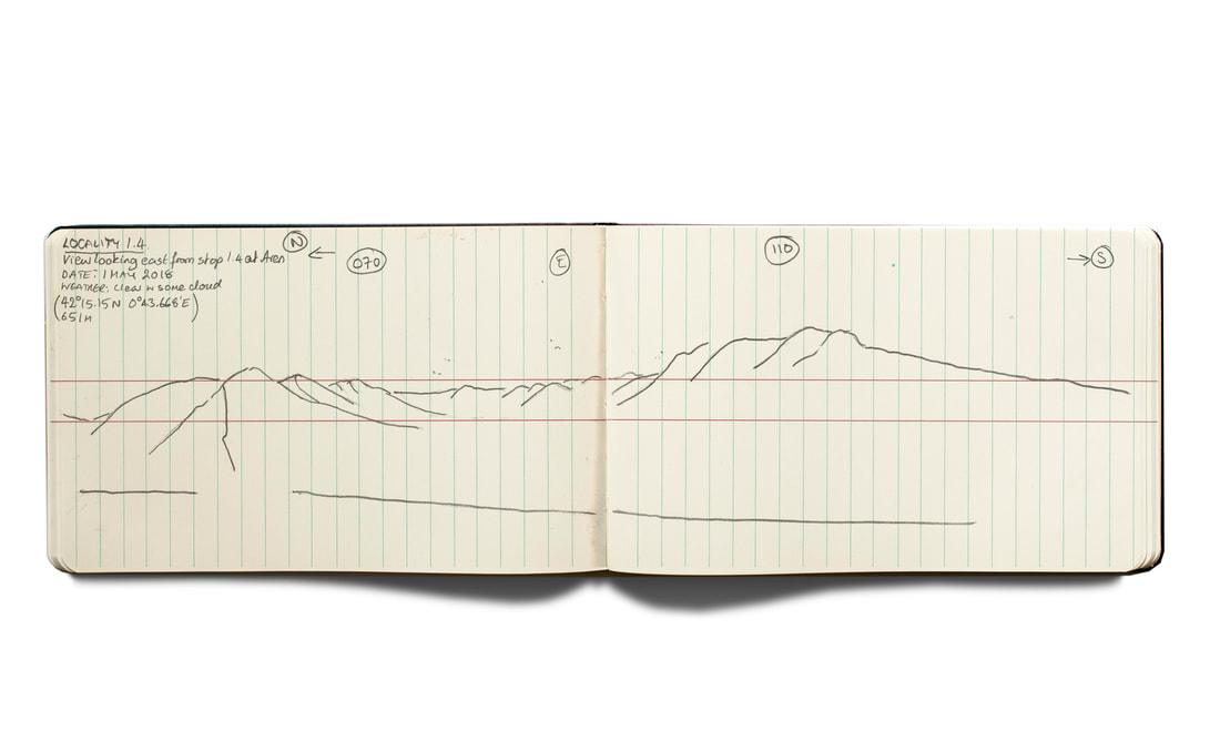 Figure 5. Add annotation, including details of the locality and geographic orientation (azimuths). You can add the locality information first, but doing so after you have identified the best use of the page for your sketch extent means that you can place the data where you have space. 7. Draw in the middle ground The aim of this is to further constrain geometric relationships and distances on your sketch. Follow plateau tops or hill slopes into the valleys. This gives you more of a framework for understanding the geology. 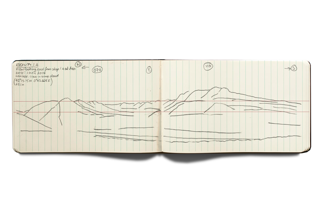 Figure 6. The middle ground provides the rest of the framework of the landscape you are capturing. Follow slopes down into the valley, cliffs and tree lines. This will help tie your sketch together. 8. Draw in trees Why draw in trees and vegetation? I find that adding landscape features such as trees can help me better remember the landscape and, more importantly, provide reference points and guides to scale that I can then see in related photographs. The vegetation also reminds me of the extent of the visible geology. 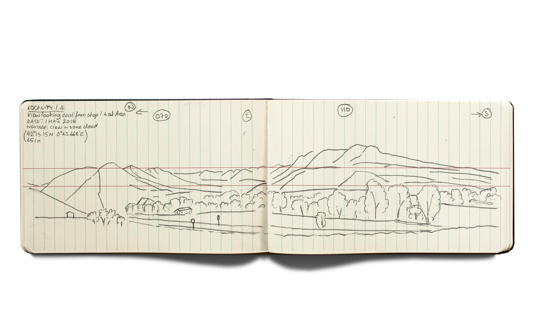 Figure 7. Adding trees and buildings provide indications of scale. They also provide reference points for locating where you are. 9. Locate and capture key geological features This includes features such as bedding or unconformities that you want to draw attention to. 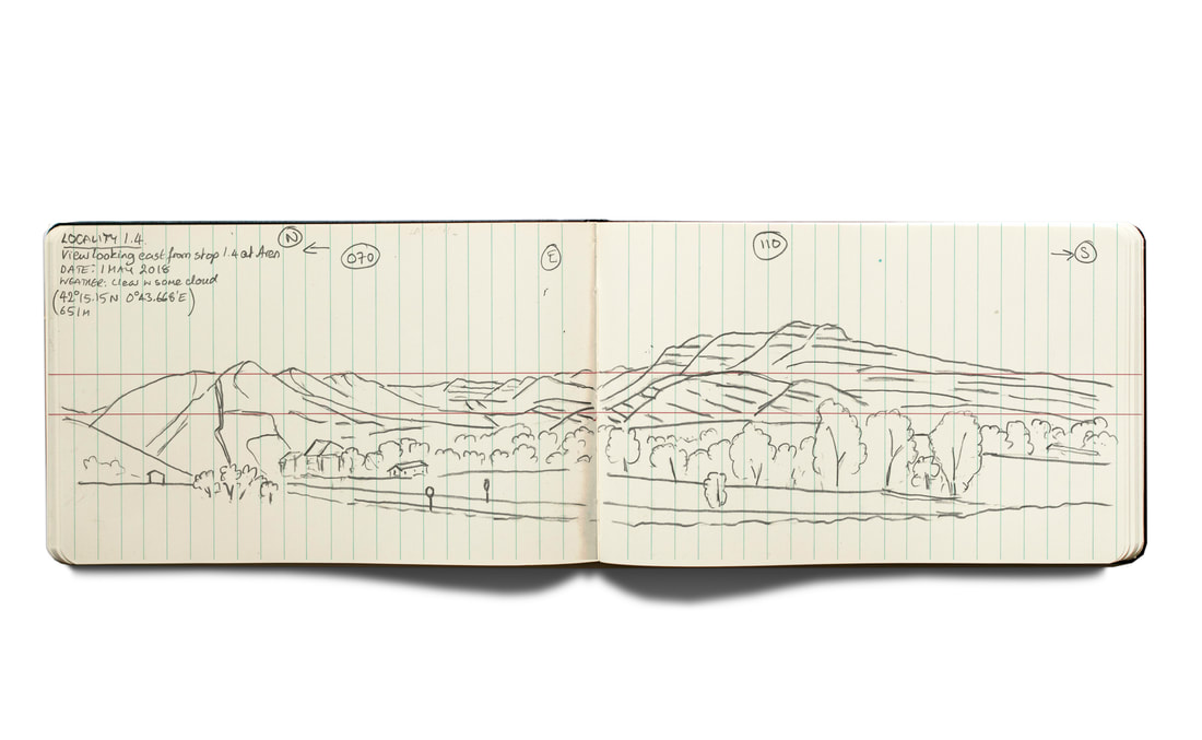 Figure 8. The final drawing stage is to add bedding and other key geological features that have not already been represented by the previous stages. 10. Annotate geological features Include any information on bedding geometry, apparent and real dip, major color changes. Any relationships between the landscape geomorphology and underlying geology. Include notes to any scaling issues resulting from your sketch (this is ad to memory for comparing with the photographs you take). Include notes of any uncertainties about interpretations or things that you want/need to investigate further. 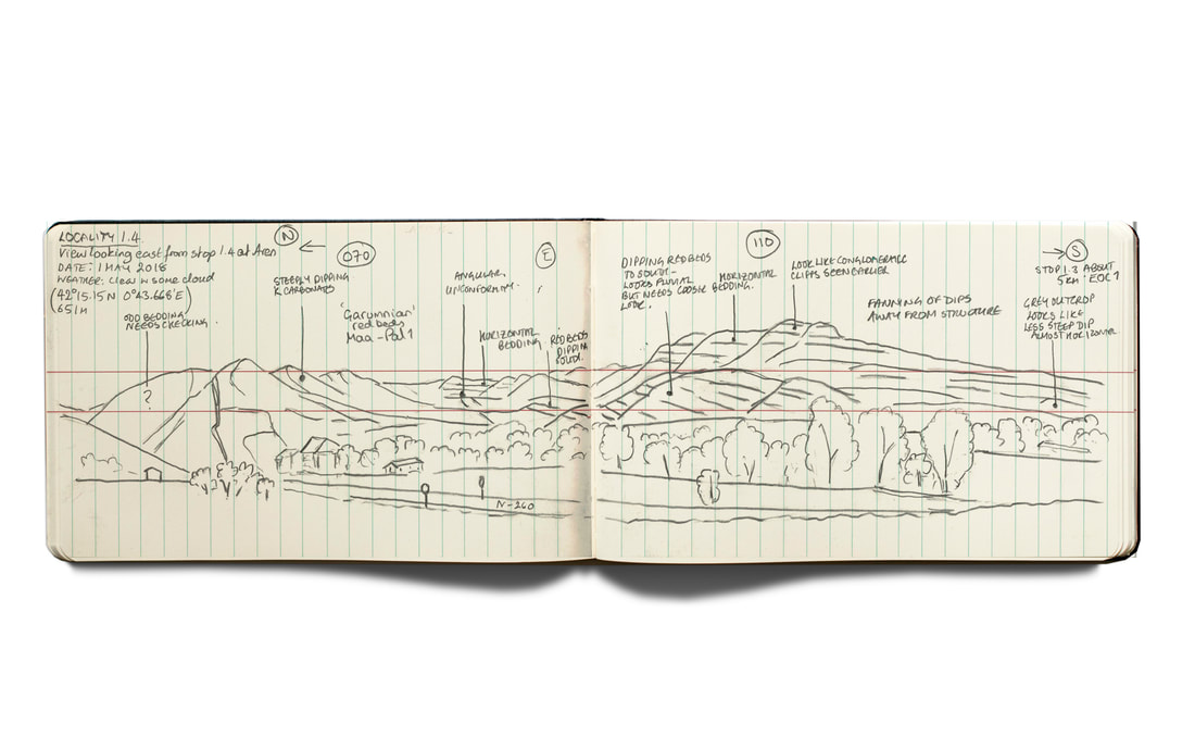 Figure 9. The final stage is to add geological annotation, dips, notes, ideas, hypotheses to test. 11. Color Whether or not you should add color to your sketch is highly contentious (Hi Amicia 😊). An advantage of keeping your sketch in black and white is that you can then scan or photograph it and add color in Microsoft Powerpoint, Apple Keynote or other graphics software (see below). However, I have found over the years that color helps me remember what I am looking at. In figure 10, I have colored the trees because they are not the geology, but they do help bring out the depth of the landscape and what parts are exposed. I have also colored the red-beds because of their importance as a marker unit. 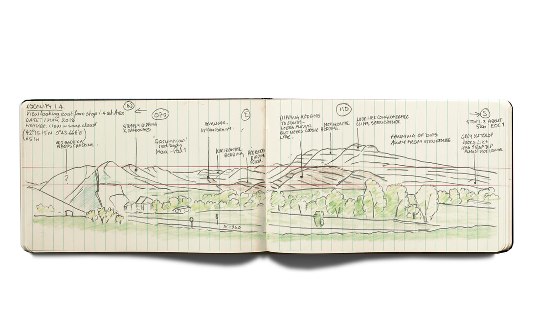 Figure 10. Adding color is highly contentious as I found out last year when one of our Ph.D. students posted a questionnaire and competition on Twitter Amicia won... black and white came top. But sometimes color can help you remember the landscape. This is less of an issue when the sketch is supported by digital photographs. Here I have colored the trees which provide information on what geology is exposed and what is not. I have also colored the red-beds as a key marker unit. 12. Photograph your sketch Just in case you drop your notebook in a puddle, you leave it in the coffee shop or at the outcrop, or it is stolen and eaten by goats. Yup, it happens.. 13. A sketch is never finished Earlier, I left open the question of dimensions, the height of the mountains, distance to the background hills. Traditionally, and even today, it is good practice to estimate these in the field (your estimates will get better the more you do this), but today we have other tools to help us in addition to checking a physical map on our return. The easiest of these is Google Maps. I touched on the use of Google Maps in my Field Photography blog last year. You can use Google Maps to look at relationships that were not clear to you in field and also to measure distances if you don’t have a physical map available. Do be careful about using the 3D perspective view (as picked here) for absolute dip measurements. My advice, is don’t. But the overall stratal geometries will usually be fine. 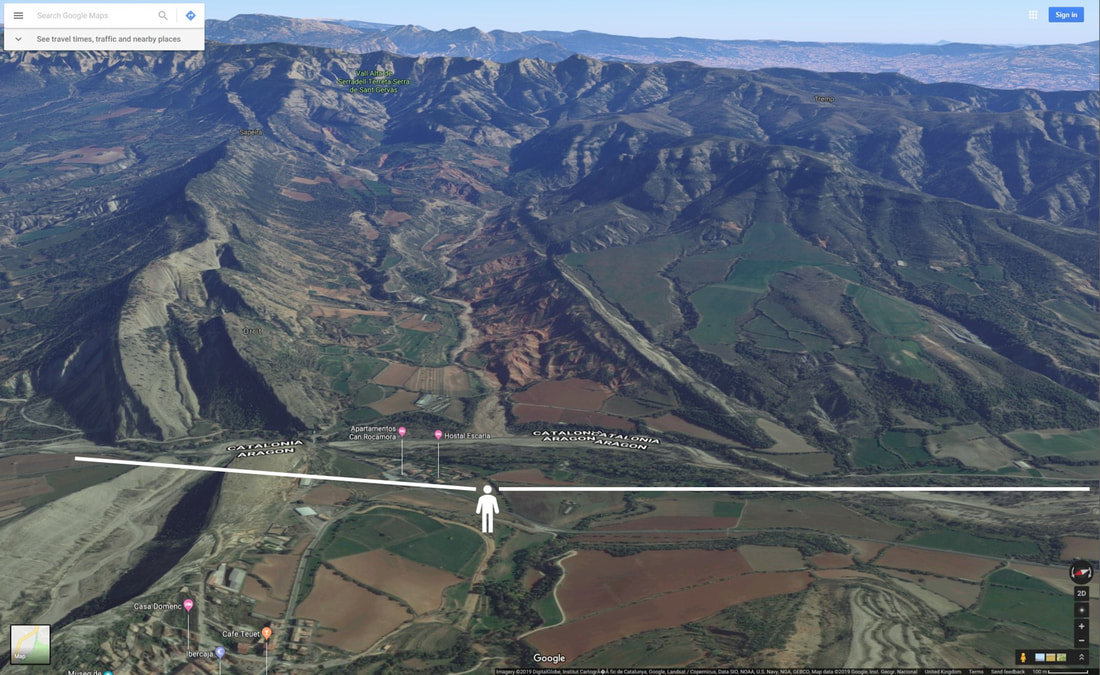 Figure 11. The Google Map view of the locality in this field sketching exercise. Immediately you get much more information on relationships, the fanning of dips and especially the sub-Late Eocene unconformity. Information that you can add to your sketch. Note that the lithological variations in the Paleocene-Eocene section become much clearer too, with the limestone unit (the Alveolinid Limestone) is a much more prominent feature. This was discussed in my blog on field photography last year. 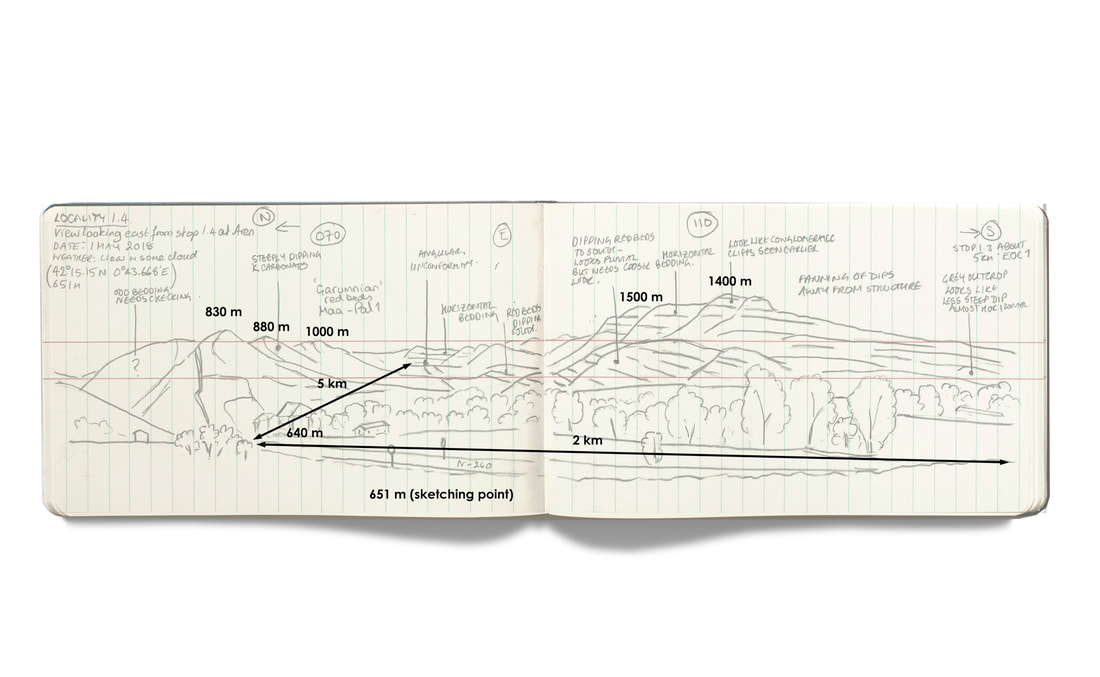 Figure 12. The addition of distances and elevations (in black) read from either Google Maps or a printed map, depending on which is available. Using simple geometry, you can then start to estimate unit thicknesses. There is another important lesson here: your sketch is never finished. As a student, or indeed any field geologist, do not draw your sketch and then walk away. By checking your observations back at base (hotel, office or tent) you can better enhance your understanding. Use all the tools available to you 14. Post-production With access to the internet and maps back at your office or hotel you can manipulate your field sketch in a graphics package to extract more information. Using maps and publications you can test out some of your hypotheses, answer questions that you wrote to yourself on the sketch, and see what others have made of the outcrop. This might mean that you have to return to an outcrop (if that option is available) as you revise your hypotheses and ideas. The aim here is, as much as anything, to help enhance your understanding of the outcrop. In this example, I have used Microsoft Powerpoint because I always have Microsoft Office on the laptop I take into the field. This means that I can simultaneously build any presentations that I might be asked to give. This is where the black and white versions of the sketch give you the most flexibility and where you can add color to pick out key geological features you want to draw attention to. In the examples here I have colored the sketch to bring out the age of units and bedding, dominant grain size and depositional environment (part of my input for a paleogeographic map). 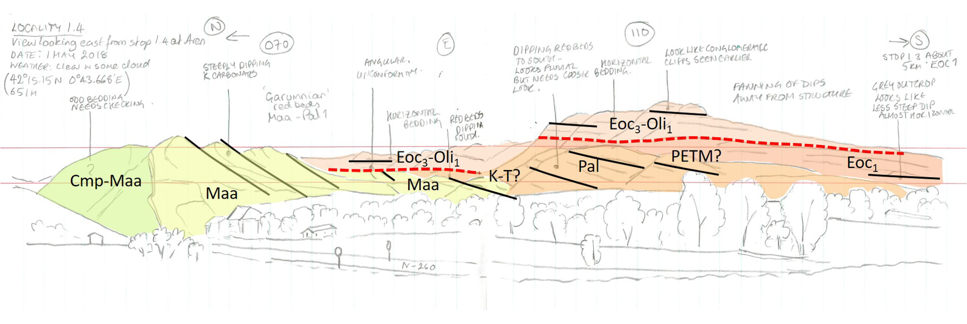 Figure 13. An advantage of keeping your sketch uncolored is that you can add color later to a digital version as here. This example was constructed in Microsoft Powerpoint with the sketch first lightened and then polygons drawn to represent unit age. This can then be added to a presentation if you are asked to give one. 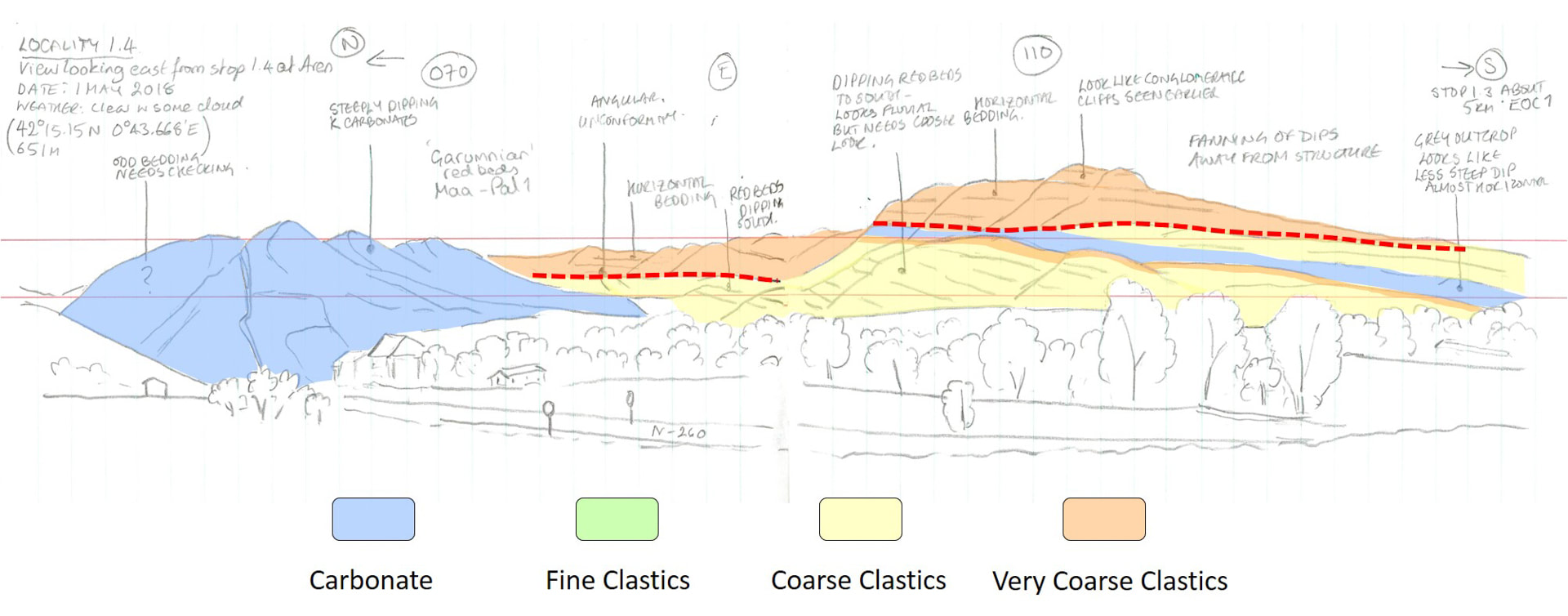 Figure 14. In this example, the units are colored according to the dominant lithology identified in the sketch and from the related geology map. 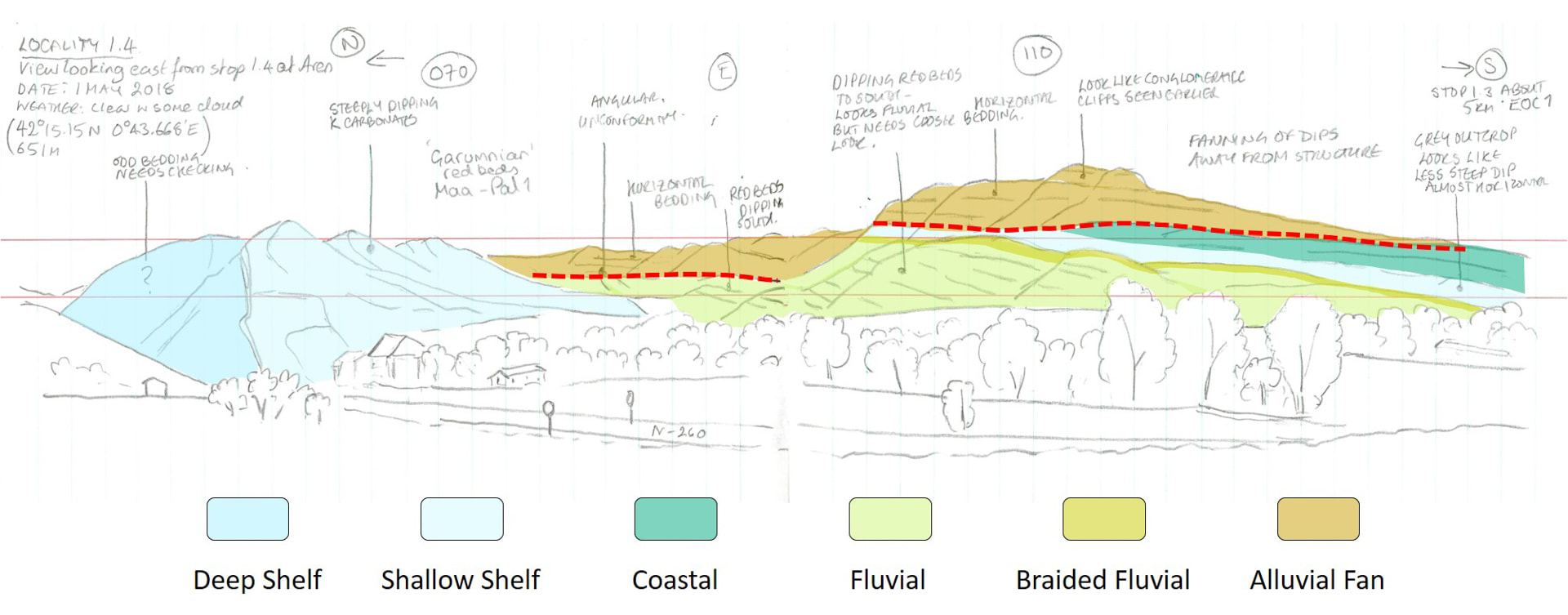 Figure 15. This example shows the same sketch now colored according to the dominant depositional environment. 15. And the answer is? At the beginning of this blog, I said that the aim of this outcrop was to identify and investigate the stratal relationships and from this interpret the nature and evolution of the structure that caused them. As in all good Agatha Christie novels, I have left answering this to the very end. This is best examined by constructing cross-sections using high-resolution geological maps (available from the excellent IGME and ICGC websites) or even better, seismic. Here let us look at this as a quick back of the envelope interpretation using the sketch. As drawn, the dips decrease to the south. This ‘fanning of dips’ is consistent with a growing structure to the north, conveniently just off picture. We are seeing the steep southern limb of the resulting anticline. The fanning appears to start with the Maastrictian-Paleocene red-beds, which indicates that this is a growing, positive topographic feature at the time. This is why this unit is such an important marker bed in this sketch. The question is what is the vergence of this structure? Here I show one interpretation. 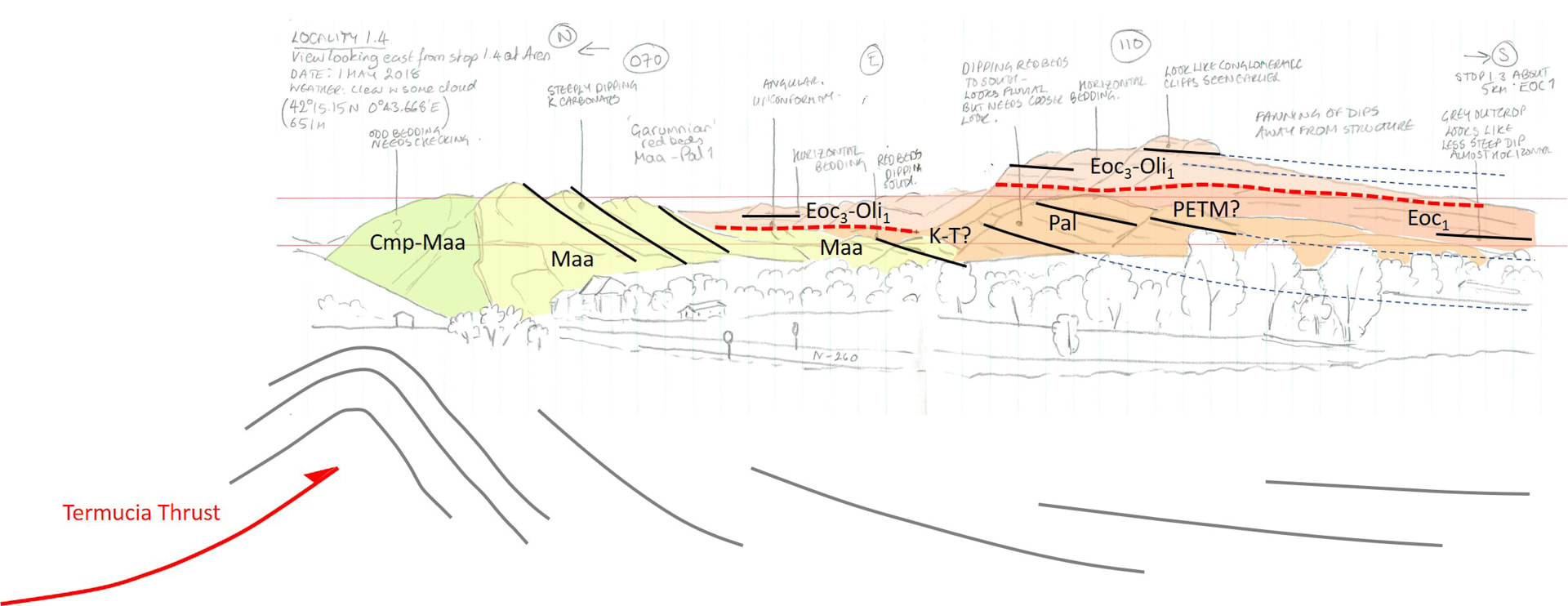 Figure 16. A back-of-the-envelope structural interpretation based on a first look at the stratal architecture. This does not immediately answer the question about vergence of the underlying structure (although we do know this from other sources) but does give us an age for the activity which is Maastrichtian – Paleocene. Which kit? The general guidance is to use a pencil in the field and to then generate an inked-in version each evening. This has the benefit of ensuring you have two copies of your notes. 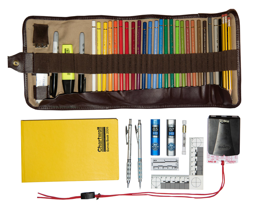 Figure 17. A sketching kit. The key elements are a notebook that can be used in landscape orientation and a good pencil. Notebooks My personal preference is the Chartwell 2006Z top opening survey book. Although this lacks the waterproofing and very useful look-up information contained at the back of the Rite in the Rain Geological Notebooks, which are great, I do like the fact that I can open up the Chartwell notebook in landscape orientation which gives me two pages for sketches. It also has two parallel lines which provide great reference lines for sketching and also for logging when in portrait view. Pencils and Pens Mechanical or regular pencils are a matter of personal choice. In the past I used Staedtler HB pencils with an eraser, but then I make sure that I have at least 6 with me each day, and 2 pencil sharpeners. But two years ago I tried out the Pentel Graphgear 1000 mechanical pencils, after reading numerous reviews, and I have to say they are impressive (all my nieces and nephews got them for Christmas! Lucky them...). To keep my pencils organized I use a Derwent Canvas Pencil Wrap . It takes up limited space and unrolls to give you easy access to pencils, pens, crayons and pencil sharpeners. Colored Pencils There are so many different colored pencil crayon brands on the market and you will probably have your favorites. I tend to pay a little bit more for my pencils to minimize broke leads - there is nothing worse than finding that the pencil leads are broken throughout the pencil – you pay for what you get! Brands like Derwent and Faber-Castell are very good. I can recommend the Faber-Castell’s GRIP pencils which are very good quality for the price with a good range of useful colors. I currently use a set of Faber-Castell Polychromos Colour pencils. They are great pencils, but probably more than needed for field sketching or seismic - I use them because I enjoy more artistic sketching as well as field sketching. This is all very much a personal and budget choice. Waterproof Clipboards There are a range of good A4 and A3 Waterproof clipboards on the market. Check out Amazon or your local art or hobby store (viz., Hobbycraft in the UK, Michaels in the US). Cameras and Phones Most of us still take large digital SLR cameras into the field. But the cameras on phones are now so good that in most circumstances these will meet your needs and certainly be ideal for capturing your field sketches. The panorama mode on the iPhone is especially useful for capturing big picture landscapes such as the example in this blog. Please remember to save your photos to the cloud or to your computer. I use Dropbox or iCloud as further backup insurance. Additional information There are some useful guides available on the internet of which the following are good to check:
Maggie Williams (University of Liverpool). “Field sketches and how to draw them” Geobus (2016). “How to draw a field sketch” Geological maps for study area: ICGC https://www.icgc.cat/en/Downloads/Geological-and-geothematic-cartography IGME http://info.igme.es/cartografiadigital/geologica/geo50.aspx A pdf version of this blog is available here for download A higher resolution version of the field photo used in this example can be downloaded here. Feel free you use this to practice your sketching. Bring the photo up on your computer screen, iPad or TV and then sketch it into your notebook. Have fun!  Creativity and communication are inextricably linked in science. Ideas in isolation, stay in isolation. For such a visual science as geology, good communication is as much about graphical presentation as the clarity, depth, and veracity of scientific arguments. The current wealth of powerful graphics and mapping software should make this easier. There are certainly some impressive publications out there that maximize this power. But sadly, not all. This is all the more important when building commercial products, where the look and feel impact user perception as much as scientific correctness. I have always been frustrated, if not a little impressed, that a client who has just bought a technical report will instantly find the one typo in 100 pages of text and imagery. The concern, as a business, is that the client’s view of that report will then be forever tarnished by that discovery. If the typo is compounded by scrappy graphics or a poor choice of color scheme, the reader may not get as far as the science and a failed sale is the result, or even worse, no future sales. And yet, too many knowledge-based companies focus only on their scientific cleverness or just getting the project done. Twenty years ago, that may have been enough. Hand-drawn figures, typed manuscripts and photocopied images from papers were accepted. That is no longer the case. This is not only because of tighter copyright laws (understandably) but also because client expectations are much higher. Consequently, the overall look and ‘feel’ of a scientific report in knowledge-based businesses is critically important. It is about perception and most of all trust. In my last directorial role, I was fortunate to hire an excellent editor and a talented draftsman to make the process easier for all and ensure quality. But you need buy-in from all your staff to make this effective. Otherwise, the pressure will fall on your editing department who will spend more and more time making staff work fit the standards you have set. Everyone involved needs to understand why a client’s perception of their work is so important and through this to get them to care about what they produce. The Italians have a wonderful phrase that encompasses my philosophy for writing and visualization, “La Bella Figura”. Although the phrase literally means “beautiful figure”, it encompasses a far broader concept, the central importance of making a ‘good impression’ that makes what you do more meaningful. With that in mind, and in the tradition of the internet, let me offer 10 tips for designing and producing knowledge-based products. In this blog, the focus will be on writing. We will look at generating figures and digital products in a future article.  When thinking of form and function it is impossible to ignore the Renaissance and the rediscovery of the lessons of classical Greece and Rome 1. Care about what you build This is the key starting point. If you care about your work and what others think of it, you will do all you can to ensure the quality of what you build. This is fundamental to the concept of la bella figura One way to encourage this in business is to include the names of all those who built the product in an author list. This provides a sense of ownership but also of responsibility. 2. Define the take-home message from the start Different readers will need/want to extract different levels of information from a technical report. For senior managers it is about the key take-home message - they will not have time for anything more. Get this written up-front and make it clear. This take-home message is the "elevator pitch" that you will frequently see referred to in marketing guides - you find yourself in an elevator with a potential client and have three floors to explain what you do and why they should buy it. The number of floors varies with the author and vintage of the elevator. In a presentation, it is often useful to state the take-home message at the beginning of your talk, in case you lose management during the presentation, and then to finish your presentation with the same statement. In print, the take-home message can form a key part of what is frequently called the “Executive Summary”, aimed, as the name suggests, at executives with limited time. The Executive Summary should be a distinct, independent printable page that can stand alone if necessary. As an example of a summary with major ramifications, have a look at that of the IPCC who direct their summary to policymakers with a series of take-home headlines. If you search for “Executive Summary” on Google (other search engines are available) you will find numerous websites focused on the design of Executive Summaries. 3. Be organized: Everything has a beginning, middle, and end Start by following the fundamental rules of writing. The most fundamental of which is that a report or presentation, just like a novel, will have a beginning, middle, and end. In the beginning, you outline what you are going to say or do, in the middle you say or do it, and at the end, you conclude by saying what you have just done. Now, this may appear a little simplistic. It is. But starting with this simple structure can help facilitate your writing. You can add detail and embellishment later. This also applies to presentations. Ending a talk with a blank screen – a particular bugbear of mine as Leeds students will know - is a missed opportunity, since this last slide will likely stay longest on the screen 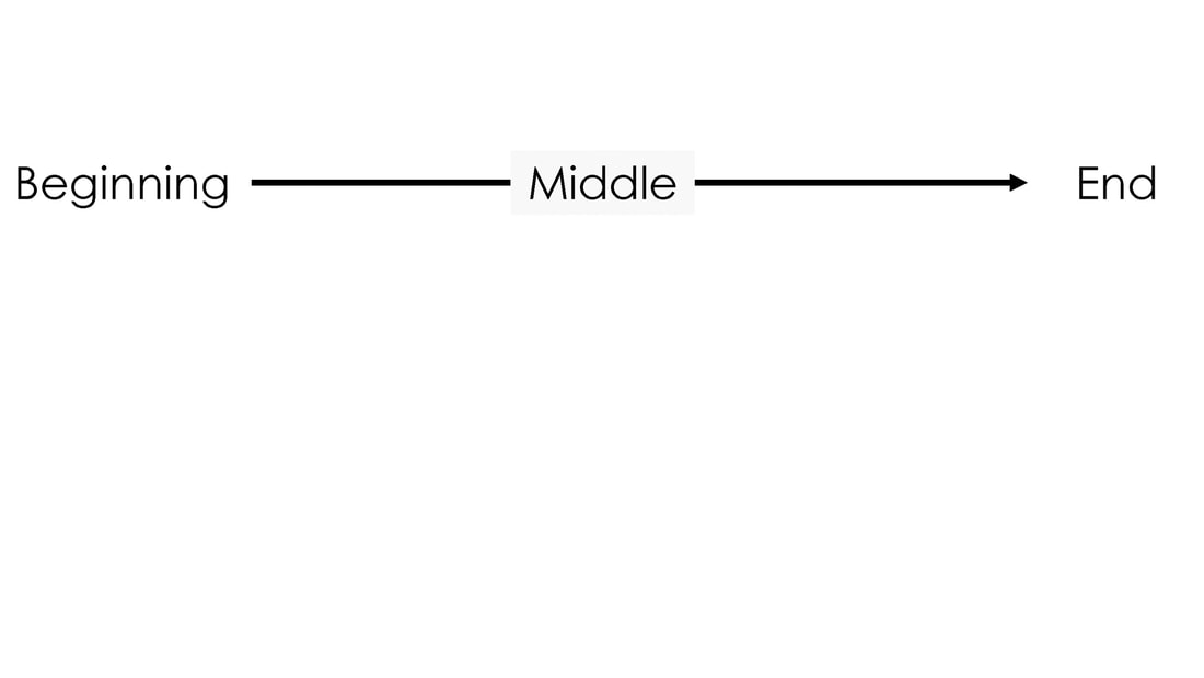 The simplest structure of any report, presentation or novel. Everything has a beginning, middle, and end 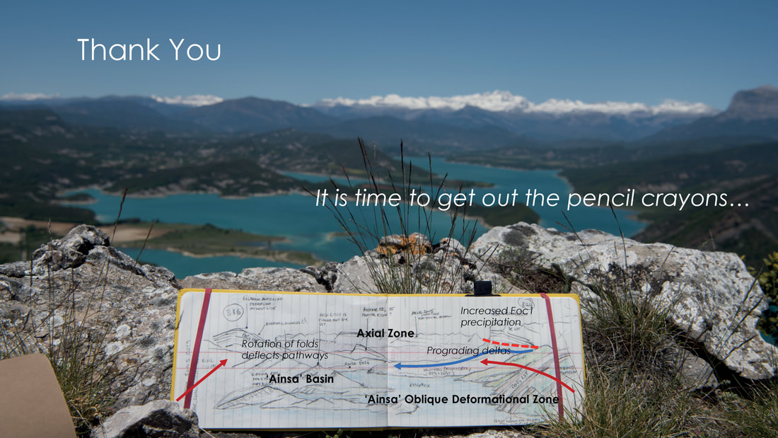 In this final slide from AAPG 2019, there is the usual outcrop picture (a version of the photo I began the talk with and which was used to set up the problem being addressed), here with a take-home which refers to the importance of using sketches and maps to manage and photo analyze diverse datasets. The sketch was animated to add a further dimension to the end of the talk and draw attention to the slide. This is also where you might include acknowledgments to funding bodies or other authors 4. What? Why? How? A beginning, middle, and end provide the overall structure. But what of the actual content? This will depend on the application and audience. For papers, reports, and presentations I usually approach this part in the same way, with an A2 piece of blank paper in front of me on which I sketch out the structure. A whiteboard will work equally well, or touch screen for those of you not familiar with paper and pen. To start with, consider the following:
I write these out first on my piece of paper or whiteboard. Remember that the what, why and how will fit within the beginning, middle and end. 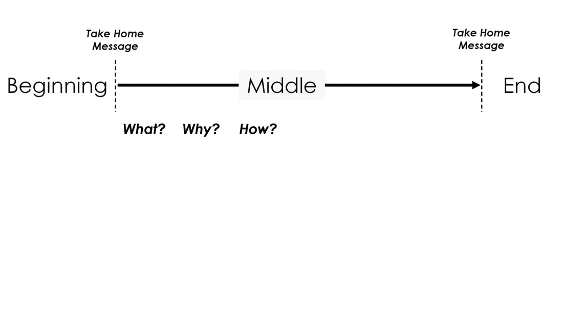 Adding the “What?” “Why?“ and “How?” forces the writer to think about their study. What it is, and most importantly why they are doing it 4.1. The “what? The “What?” can be divided into two sections/slides:
And yes, there is a difference between aims and objectives:
For example, you might want to understand why the Earth's climate changes. That would be your aim. The objectives might then include (1) measuring CO2 in the atmosphere over 10 years and producing a table and/or graph to show this; (2) a review of past observed changes in climate written as text (or a graph); (3) running a climate model with different atmospheric CO2 concentrations with physical results. The key differentiator is that each objective has a tangible outcome. The aim, in contrast, need not be achieved, frustrating as that will be (been there...). This also means that for any project, and certainly for a commercial report, you should be able to tick off each objective on completion within your project plan. 4.2. The “why? The “Why?” is critically important. If you don't know why you are doing something, then why on earth are you doing it. I usually include a section or slide with the title of "The Nature of the Problem". This includes a statement of the problem to be solved and its history. In a paper "the why" can include the background to the subject. Frequently the background will form a separate section to do service to those who have gone before, which is very important in understanding what needs to be done and why. Understanding the current and past literature is essential in my view. (There is certainly a place for exploratory science, where you don’t know the why, nor the possible outcomes, but such studies are not the easiest to get funded, for obvious reasons). 5.3. The “how? The “How?” relates to the "Data and Methods", usually included in any paper or presentation as a section in its own right. This includes the data used as input to whatever you are doing. The methods include any techniques or workflows that will help the reader understand how you have solved the problem and also ensures that they could if needed, replicate what you have done. This is the basis of good scientific practice, whether academic or commercial. 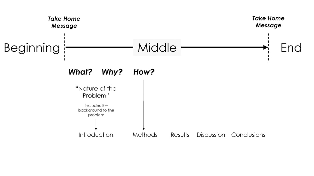 4.4. Results We have now posed the “What?”, “Why?” and “How?”, and it is time to show the results of the “What?”. This is usually titled, unoriginally, but clearly as a "Results" section. 4.5. Discussion A “Discussion” can follow which takes the results of the objectives (part of the “What?”) and discusses it within the context of aim(s) (the “What?”). This is the section in which you as the author get to the nitty-gritty of the project and what it means. 4.6. Conclusion The conclusions bring the report, paper or presentation to an end. Here you succinctly reiterate the take-home message, and any other key headlines you want your audience to walk away with. 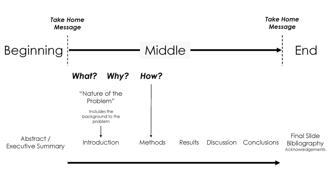 We can then top and tail the report with the “Executive Summary” and bibliography, acknowledgments and appendices 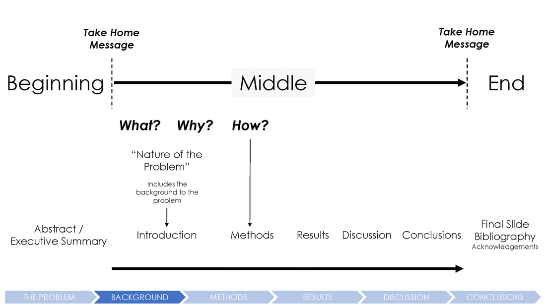 In presentations, we can provide a talk structure for the audience to follow. For my talks, I will frequently use labels at the bottom of the screen that shows where in the talk we are (darker blue fill in this case). The overall structure is the same 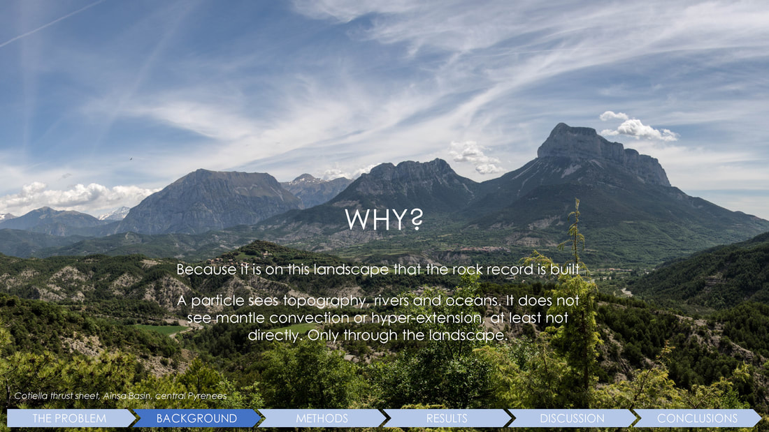 Here, we can see this applied to an actual slide from a talk. In this case a talk on paleogeography 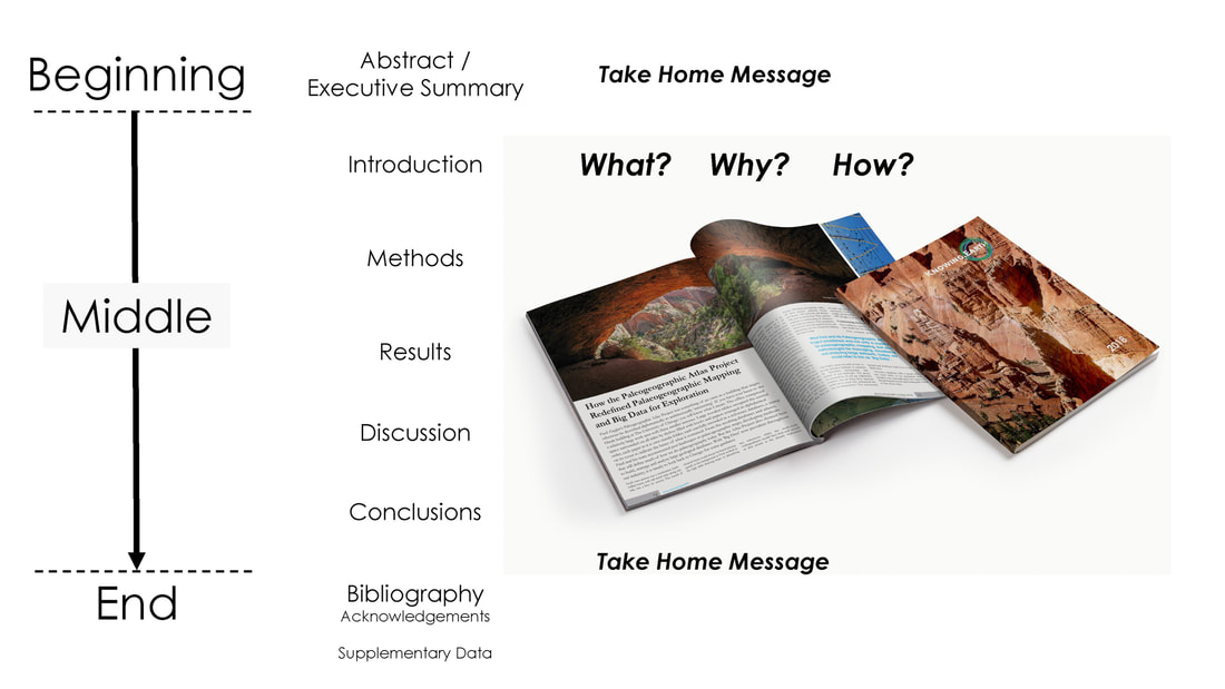 In reports or papers, we think of the ordering from top to bottom as given in a Table of Contents, rather than as the left to right progression in a presentation 5. Hyperlinks and document navigation As a reader, it is important to be able to find information quickly within a text or database(s). This is similarly important in a report. Navigating within this structure and through the content is much easier in the digital world. Software such as Adobe InDesign or Microsoft Word will allow you to quickly add sections, tables of contents, bookmarks, and indexes. In digital products, the use of hyperlinks is common and very useful, but do check that hyperlinks work. The use of relative paths and a systematic folder structure for your associated files is strongly recommended and something to establish before you start a project. 6. Keep it simple and succinct .Clarity and simplicity are key if you want to be fully understood. Do not try to prove your cleverness by making what you produce only decipherable by you. As someone who can be rather ‘Victorian’ in my writing style, this has been a hard-learned lesson - one of my colleagues recently referred to my writing style as “chatty”... I do not think that this was meant as a compliment. In the age of social media and especially Twitter, attention spans are short, and you need to convey your message as quickly and precisely as possible to your audience. Most scientific journals now provide a supplemental data section that will allow you to place additional information outside of the main paper. This shortens the main text, whilst still enabling fellow scientists to replicate what you do, which is fundamental to the scientific method 7. Choose your font(s) with care Frequently, choosing a font is something of an afterthought. That is a shame because much of what your reader will see is what is written, i.e, the font (typeface). Journals will have their own preferred sense over which you will have no control, but if you are setting up a business you may want to consider the look and ‘feel’ of your written word. In choosing a font, think about how you want your clients and readers to view your work. A classic, academic look (viz., Times New Roman font) or a more modern fresher look (such as Century Gothic or Avenir). Also, consider whether the font will be used online or printed or both. There are a number of websites that can help you chose the right look. But in so doing also bear in mind that some fonts are freely available on all platforms (Windows, Mac), others are not, or, worse, will require a license. Once you have a font assigned with a look that is 'yours', keep to it. My preference has been to go with Century Gothic for online work (I prefer Avenir, but it is not freely available on Windows) and Garamond for printed text. Both are readily available and free.  A comparison of three different fonts with different ‘feels’ and applications. One further point on fonts, if you will forgive the pun, is not to mix too many fonts in the same document or presentation. 8. Check your spelling With spell checkers built into Microsoft Word and other programs, there is no excuse for typos. There are also 3rd party programs that are worth considering. I can recommend using the free version of Grammarly which I have found to be accurate and informative. This is the software I use regularly.  Kilometres or Kilometers? British English or American English 9. Choose your language and keep to it This is becoming increasingly contentious given increasing nationalistic buffoonery, especially for English speakers where the language can be quite fluid and varies by region. I live in Yorkshire… enough said… The main choice for those of us writing for the international market is whether we use American English or British English. Having spent eight years of my life in Chicago and having academic co-workers across the US and many clients in Houston and around the world, I do find myself mixing these two English variants. At one level, this does not matter. At the risk of being trolled for suggesting such a thing, bear in mind that prior to Noah Webster's first Webster dictionary English in the 18th century, spellings and pronunciations were interchangeable across the Atlantic, gray and grey, labour and labor, etc. Journals and publishers will have their own strict rules about spelling and language that you will need to keep to. But if you have a choice in setting up a business, then go with one and stick to it. I suggest that If you do international business that you use ‘American’ English because it is now more widely accepted and the form that most people learn and experience via the internet, film, and TV. 10. Print out the final results and ask yourself one simple question: would you pay monies for this? I find it useful to print out what I produce to give me a sense of what the reader will experience. This can be also important where you are binding material in a book or magazine format and where margins become very important but may not be so onscreen. Looking at the results are you proud of what you have written and produced? Think la bella figura  Always print out what you write and create and ask yourself one simple question: would I pay for this FURTHER INFORMATION There are a large number of guides to writing, including physical books and online resources.
I can recommend “The Elements of Style” by William Strunk, Jr. This is concise, and an easy read (a few hours). ”The Chicago Manual of Style” produced by The University of Chicago, is a more comprehensive reference book and one that sits on my shelf for emergency reference. This book is now in its seventeenth edition. For a discussion on the meaning of the phrase "bella figura" have a look at this interesting article by Carol King (2012). Italy Magazine. “Bella figura and brutta figura: Italy’s beauty and the beast” I use Blurb.com for publishing. Check out their website for guides on layouts. A pdf version of this blog is available here for download |
AuthorPaul Markwick Archives
August 2020
Categories
All
|
 RSS Feed